
If you have a company or a brand that has a social media presence, chances are you’re going to need to create a graphic to accompany a post now and again. Making those graphics can be arduous and time consuming unless you have a few tricks up your sleeve. A key aspect to making your social graphics look great is understanding its composition; the layout of a graphic is what makes it eye-catching (or not). And, in social media, it’s all about getting noticed. Understanding what makes a “good” graphic will help you to gain and maintain your audience.
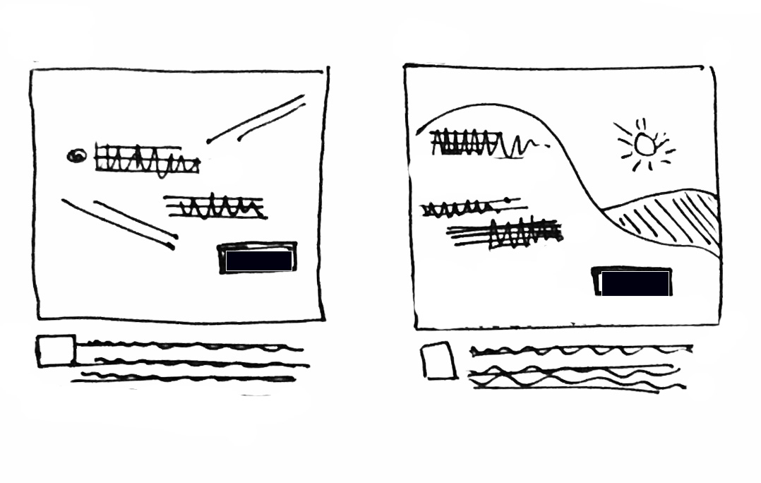
Diagonals and curves
When a photo or an element in your composition has a strong diagonal, our eye naturally follows the edge of that diagonal or curve to see where it end up. A clever designer can use that effect to help a viewer ‘discover’ the important information in a composition.
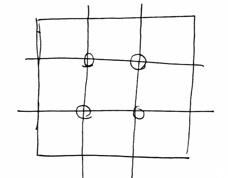
Rule of thirds
Used by photographers everywhere, the ‘rule of thirds’ is a tried-and-true way to create a feeling of harmony in your composition. In this method, divide your graphic using 2 horizontal lines and 2 vertical lines, so that they intersect and make a grid with equal sized rectangles. Then, position the important elements in your scene at the points where the lines meet.
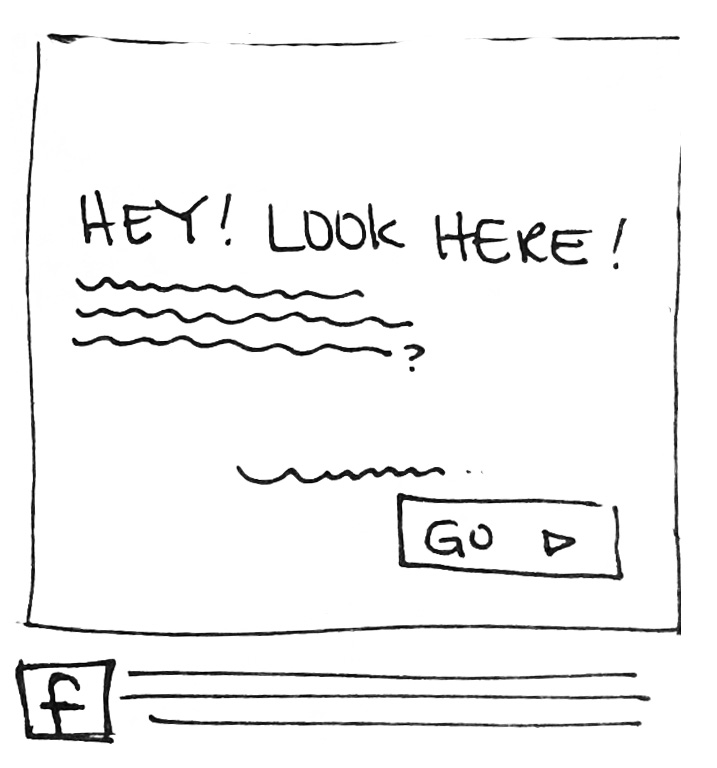
Hierarchy
When using words and pictures together, things get complicated. Which is more important? The words? The picture? The button link? The logo? Step back, and ask yourself what message you want to convey. What is truly the most important point? Once you have determined the one thing, place that thing in a prominent spot, and use all the other elements as supporting characters by making them smaller, not as bright, or further away from the thing you determined *most important* in the graphic. Hint: if you have button in the graphic, it’s probably the most, or second most important item, because it is asking the user to take action.
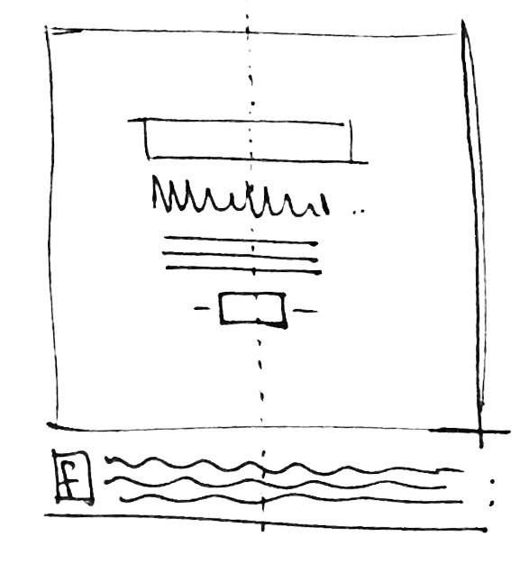
 Symmetry
There’s something so pleasing about symmetry. In this composition, the space and items on the left and right (or top and bottom) are equal. You can achieve this balance by placing a logo and words in the center of the artwork, aligned with one another. Pay attention to the vertical spaces between lines of text– they should be equidistant from one another. If they are not, it will disrupt the harmony you’re creating. Use this composition when you want to create a feeling of peace or strength.
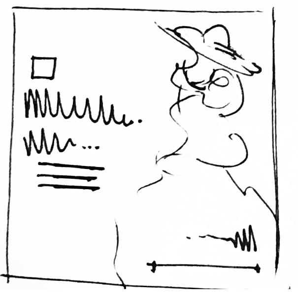
Asymmetry
When the two halves of a composition are not the same, it’s called an asymmetrical composition. Although it seems like this type of layout should always be unbalanced by definition, there are a number of ways to equalize an asymmetrical design. For instance, you can rely on using enough blank space on one side to counteract all the elements on the other side. Or, place an element of a different shape and/or color opposite the focal point of your graphic which is just as ‘important’ as what it balances. Think of this as yin and yang. What is needed on each side of the image to make the visual weight feel even, even if it is different or opposite? This is perhaps the most complex concept discussed here, but the payoff is big. Viewers find asymmetrical compositions more interesting and engaging, when they’re done correctly. I think it’s because these compositions feel less formulaic and are more fun to discover.
Try out these concepts, and see how your social media imagery advances. As a short-cut, find pre-existing templates that follow these rules, and plug your information into the template. If you stumble upon a design that really works for your brand, by all means–reuse it! Reusing layouts and changing out the content will help create consistency in your social media feed.