You spent the money to have a professional design a new website for you, and it looked great when it launched. But some time has passed, and the site doesn’t seem so clean and balanced as it once was. You can’t put your finger on what makes it feel “off” and you’re bothered that the website just isn’t looking as great as it once did. What’s going on? And most importantly, how do you fix it?
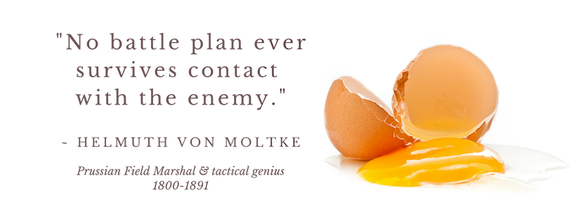
This adage is as true for websites as it is for the battlefield. A site designer can not always anticipate all the data types that you’d want or need to put into the website. There may be people modifying the website now who were not part of the development process, or who never learned the reasoning behind the design patterns.
Whatever the reason for the design going off the rails, there are things you can do to bring a website back into line. These steps are not hard to do, but they do require vigilance and some attention to detail.
- Pay attention to the fonts
- Take time to identify hierarchy of information
- Stick with the rhythm
Pay Attention to the Fonts
The fonts on a website are a big part of the site’s look and feel. Headlines, sub headlines, and body fonts work together to create that harmony that you approved when the site launched. If blog posts, articles, and new page additions deviate from the set of established fonts, that content is going to stick out like a sore thumb. You’re better off sticking with the defined styles, and using those to your advantage.
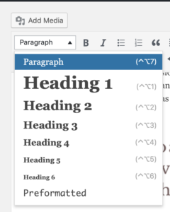
Your designer will have defined a look for each of the headline styles: H1, H2, H3, H4, H5, & H6. in WordPress, you can access those styles by highlighting some words, and then using the drop-down menu in the upper left corner of the post editor to select a new type style.
If you have access to other fonts, font colors, and styles, resist the urge to use them. Stick with the predefined styles and create a sense of continuity, sophistication and balance in the typography of your site.
Take Time to Identify the Hierarchy of Your Information
In any set of information that you want to use for a blog post, page, or an area on a pre-existing page, there will be a natural hierarchy that you need to uncover. This ranking of information will help a user scan the content and quickly grasp your meaning. These important points can be used as headlines, pull-quotes, sidebars, or items worthy of illustration.
Editing is important to maintaining your site design, because only certain items in your text are the most important to help the user navigate your content. If you choose to make many things important, that diminishes the importance of the highlighted items. Once you have defined the top-level phrases, use them to help the user scan the content by making those items stand out, using some of the pre-defined styles in your site design as discussed above.
Stick with the Rhythm
A designer uses text and images, colors, shapes, blocks of text and even blank space to create a balanced design in your site. Remember that you hired that professional for a reason. He or she developed a color palette just for your site, a style for the photography or illustrations, and defined proportions for the overall page layout. You invested time, money, and mental energy in collaborating on those choices.
When adding new illustrative content, use artwork that matches the style, color palette, and overall feeling of the existing media. When adding new text or call-outs on the site, utilize the colors already found in the current site’s palette, rather than introducing new colors. This is perhaps where you’ll need to be most vigilant.
Everyone wants to make their mark and create something of their own vision; but when you’re editing an existing website, stick with the patterns your designer established to maintain that elusive sense of balance. This will create feeling of strength and consistency in your site, reinforce your brand, and the investment you made will pay off for years to come.
![]()